Microplot documentation
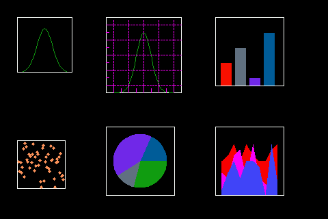
Framework to display different plots in displayio. Similar to widget Take a look in the examples section in RTD to see the gallery
microplot is to be used with CircuitPython as some of the behind the curtains methods are in the CircuitPython core and could differ from MicroPython or Python
Quick Start
A small tour explaining microplot.
Plot Usage
We start by importing some fundamental libraries for the plot library to operate
import board
from circuitpython_uplot.plot import Plot
For reference, screens in CircuitPython are defined from left to right and top to bottom. This means that our (x=0, y=0) coordinates would be in the left upper corner of the screen. For boards or feathers with an integrated screen the following statement will initiate the screen
display = board.DISPLAY
For other displays please consult their support library
After this, we are ready to add the plot area. The following code will create a plot area that will cover the whole screen. However you can select any area of the screen.
plot = Plot(0, 0, display.width, display.height)
The plot object will be used to display our graphics. The position and the size of the plot area could vary. This allows us to have more than 1 plot at the same time in the screen. Each one of them can have different characteristics or graphs according to your needs.
- Options available to customize the plot area are:
width: width of the plot area
height: height of the plot area
background_color: allows you to change the background color. The default is black.
box_color: allows you to change the box color. This default is white.
padding: allows the user to give the plot area a pad. This is helpful if you are planning to include text and legends in the axes.
scale: scale of the plot. This will allow a plot to be scaled up at a user defined rate. This is only available for logging and bar plots.
We then tell the microcontroller to display our plot:
display.show(plot)
And this is how to build a plot area to add amazing graphs!
Good Luck!
Graphics
The following objects can be added to the plot area:
- Elements in the library
Cartesian Plane
Fillbetween graph
Stackplot
Bar graph
Pie Chart
Colormap
Polar graph
SVG (Rudimentary support)
Logging graph
Display_shapes library objects
Histograms from the uhistogram library
Boxplots from the uboxplot library
Individual Vectorio Objects
It is possible to add directly to the plot area using the plot bitmap object as shown below
The following code shows an example adding a shape from the Adafruit_Display_shapes library
import board
from adafruit_display_shapes.polygon import Polygon
from adafruit_display_shapes.roundrect import RoundRect
from circuitpython_uplot.uplot import Plot

display = board.DISPLAY
plot = Plot(0, 0, display.width, display.height)
roundrect = RoundRect(30, 30, 61, 81, 10, fill=0x0, outline=0xFF00FF, stroke=6)
plot.append(roundrect)
display.show(plot)
Ticks and Grid
Plot axes are shown by default. To change this behaviour you would need
to use the correct keyword in the Plot.axs_params function:
- Plot.axs_params(axstype='box')
- Parameters:
axstype – Option to display the axes. Defaults to “box”
- Options available are:
box : draws a box
cartesian: draws the left and bottom axes
line: draws the bottom axis
The following snippet shows how to create a cartesian plot
plot = Plot(0, 0, display.width, display.height)
plot.axs_params(axstype="cartesian")

Tick spacing and numbers are selected and calculated by default. In Cartesian and Logging Plots you can select the ticks to show in the plot. For other plots, it is possible to customize the following parameters:
- Plot.tick_params(showtick, tickx_height, ticky_height, tickcolor, tickgrid, showtext, decimal_points)
plot.tick_params(tickx_height=6, ticky_height=6, tickcolor=0x000000)
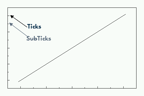
Be aware that ticks are not shown by default. If you want to show them you need to add a graph to the plot.
Gridlines are normally OFF. If you want visible gridlines then use:
plot.tick_params(tickgrid=True)
If you want to show the axes text, you can use:
plot.tick_params(showtext=True)
If you want to show some decimal places in the text use:
plot.tick_params(decimal_points=2)
Colors
You can choose some colors directly from the library. This can be done by importing the color class:
from circuitpython_uplot.plot import color
- This will allow you to use the colors in the list as color variable definitions
WHITE
BLACK
RED
GREEN
BLUE
PURPLE
YELLOW
ORANGE
TEAL
GRAY
PINK
LIGHT_GRAY
BROWN
DARK_GREEN
TURQUOISE
DARK_BLUE
DARK_RED
plot = Plot(0, 0, display.width, display.height, background_color=color.WHITE, box_color=color.BLACK)
Cartesian
With the cartesian class is possible to add (x,y) plots. You add it to the plot area created as explained
above. Then you will need to give some x and y data. The following code
from ulab import numpy as np
from circuitpython_uplot.plot import Plot
from circuitpython_uplot.cartesian import Cartesian

display = board.DISPLAY
plot = Plot(0, 0, display.width, display.height)

x = [0, 1, 2, 3]
y = [0, 2, 4, 6]
After the initial setup we add our xy plane and show our plot
Cartesian(plot, x, y)
display.show(plot)
You can add more than one graph to the same plot. Howver, you need to define the range of the graph as the two graphs will share the same axes.
- There are some parameters that you can customize:
rangex and rangey: you could specify the ranges of your graph. Allowing you to move your graph according to your needs. This parameters only accept lists. This is needed for plotting more than one curve in the plot area.
line color: you could specify the color in HEX. Or you could use the color class as explained above.
line style: you could specify the line style. The default is a solid line. see below for more details
fill: if you selected this as
Truethe area under your graph will be fillednudge: this parameter allows yuo to move a little bit the graph. This is useful when the data start/end in the limits of your range
With the following code, we are setting up the x axis to [-5, 5]
the y axis to [0, 1], line color to Green 0x00FF00 and no filling
x = np.linspace(-3, 3, num=50)
constant = 2.0 / np.sqrt(2 * np.pi)
y = constant * np.exp((-(x**2)) / 2.0)
Cartesian(plot, x, y, rangex=[-5, 5], rangey=[0, 1], line_color=0x00FF00)
if you want to add more than un line to your plot, you could do something like this:
plot = Plot(0, 0, display.width, display.height)
x = np.linspace(-4, 4, num=25)
y1 = x**2 / 2
y2 = 2 + x**2 + 3 * x
Cartesian(plot, x, y1, rangex=[-5, 5], rangey=[0, 1])
Cartesian(plot, x, y2, rangex=[-5, 5], rangey=[0, 1])
display.show(plot)
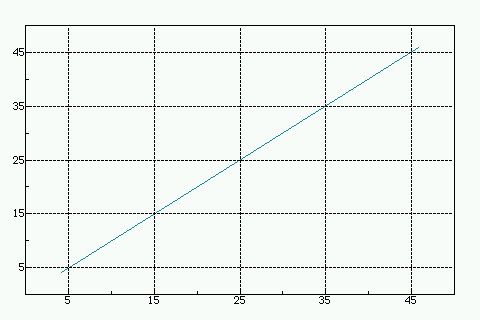
if you need to override the ticks automatic rendering, you can use the following code:
plot = Plot(0, 0, display.width, display.height)
x = np.linspace(-4, 4, num=25)
y1 = x**2 / 2
Cartesian(plot, x, y1, ticksx=[-4, -2, 0, 2, 4], ticksy=[0, 5, 10, 15, 20])

display.show(plot)
If you are adding more than one curve to the plot ticks will be defined for all curves. And needs to be defined in the first cartesian graph added to the plot.
Line styles
- You can select the line style of your Cartesian graph. The following line styles are available:
SOLID
DOTTED
DASHED
DASH_DOT
This can be done by importing the color class, from the cartesian library:
from circuitpython_uplot.cartesian import LineStyle
You can select a dotted line by using the following code: line_style=LineStyle.DOTTED.
Cartesian(plot, x, y, line_style=LineStyle.DOTTED)
Pie Chart
You can easily create Pie charts with plot. Pie Charts are limited to 6 elements as per the automatic coloring. To make the Pie Chart the data needs to be in a python list form. The library will take care of the rest
import board
from circuitpython_uplot.uplot import Plot
from circuitpython_uplot.pie import Pie

display = board.DISPLAY
plot = Plot(0, 0, display.width, display.height)
a = [5, 2, 7, 3]
Pie(plot, a)
display.show(plot)
There are no other special parameters to customize
Scatter
Creates a scatter plot with x,y data. You can customize the circle diameter if you give the radius as a list of values for (x,y) data
from random import choice
import board
from ulab import numpy as np
from circuitpython_uplot.uplot import Plot
from circuitpython_uplot.scatter import Scatter

display = board.DISPLAY
plot = Plot(0, 0, display.width, display.height)

a = np.linspace(1, 100)
b = [choice(a) for _ in a]
Scatter(plot, a, b)
- There are some parameters that you can customize:
rangex and rangey: you can specify the ranges of your graph. This allows you to move your graph according to your needs. This parameters only accept lists
radius: circles radius/radii. If a different value is given for each point, the radius should be a list of values. If selected pointer is not a circle, this parameter will be ignored
pointer_color: you can specify the color in HEX. Or you could use the color class as explained above.
pointer: you can select the pointer shape. The default is a circle. See below for more details
nudge: this parameter allows you to move the graph slighty. This is useful when the data start/end in the limits of your range
a = np.linspace(1, 200, 150)
z = [4, 5, 6, 7, 8]
radi = [choice(z) for _ in a]
b = [choice(a) for _ in a]
Scatter(plot, a, b, rangex=[0,210], rangey=[0, 210], radius=radi, pointer_color=0xF456F3)
Pointer styles
- You can select the pointer style of your Scatter graph. The following pointer styles are available:
CIRCLE
SQUARE
TRIANGLE
DIAMOND
This can be done by importing the color class, from the cartesian library:
from circuitpython_uplot.scatter import Pointer
You can select a square pointer using the following code: pointer=Pointer.SQUARE.
Scatter(plot, a, b, pointer=Pointer.SQUARE)
Bar Plot
Allows you to graph bar plots. You just need to give the values of the bar in a python list. You can choose to create shell or filled bars or 3D projected bars.
import board
from circuitpython_uplot.uplot import Plot
from circuitpython_uplot.bar import Bar

display = board.DISPLAY
plot = Plot(0, 0, display.width, display.height)


a = ["a", "b", "c", "d"]
b = [3, 5, 1, 7]
Bar(plot, a, b)
You can select the color or/and if the bars are filled
Bar(plot, a, b, color=0xFF1000, fill=True)
You can also select the bar spacing and the xstart position:
Bar(plot, a, b, color=0xFF1000, fill=True, bar_space=30, xstart=70)
For bar filled graphs you can pass a color_palette list. This will allow you to select the color of each bar This will not work for shell bars.
import board
from circuitpython_uplot.uplot import Plot
from circuitpython_uplot.bar import Bar

display = board.DISPLAY
plot = Plot(0, 0, display.width, display.height)
Bar(plot, a, b, fill=True, bar_space=30, xstart=70, color_palette=[0xFF1000, 0x00FF00, 0x0000FF, 0x00FFFF])
With the projection argument you can show the bars with projection. This will give them a 3D appearance
import board
from circuitpython_uplot.uplot import Plot
from circuitpython_uplot.bar import bar

display = board.DISPLAY
plot = Plot(0, 0, display.width, display.height)


a = ["a", "b", "c", "d"]
b = [3, 5, 1, 7]
Bar(plot, a, b, color=0xFF1000, fill=True, bar_space=30, xstart=70, projection=True)
For filled unprojected bars you can update their values in real time. This is useful for data logging. The max_value argument will allow you to set the maximum value of the graph. The plot will scale according to this max value, and bar plot will update their values accordingly
import board
from circuitpython_uplot.uplot import Plot
from circuitpython_uplot.bar import Bar

display = board.DISPLAY
plot = Plot(0, 0, display.width, display.height)


a = ["a", "b", "c", "d"]
b = [3, 5, 1, 7]
my_bar = Bar(plot, a, b, color=0xFF1000, fill=True, color_palette=[0xFF1000, 0x00FF00, 0xFFFF00, 0x123456], max_value=10)
Then you can update the values of the bar plot in a loop:
my_bar.update_values([1, 2, 3, 4])
Also for Filled unprojected bars you can change all bars color at once. The following code will change all the bar’s color to red
my_bar.update_colors(0xFF0000, 0xFF0000, 0xFF0000, 0xFF0000)
If you prefer, you can change the color of a single bar using the code below that will change the first bar to Blue.:
my_bar.update_bar_color(0, 0x0000FF)
Fillbetween
This is a special case of cartesian graph and has all the attributes of that class. However, it will fill the area between two curves:
import board
from ulab import numpy as np
from circuitpython_uplot.uplot import Plot
from circuitpython_uplot.fillbetween import Fillbetween


display = board.DISPLAY

plot = Plot(0, 0, display.width, display.height)

x = np.linspace(0, 8, num=25)

y1 = x**2 / 2
y2 = 2 + x**2 + 3 * x

Fillbetween(plot, x, y1, y2)

display.show(plot)
Color Map
Allows you to graph color maps. You just need to give the values in a ulab.numpy.array. You can choose the initial and final colors for the color map.
import board
from ulab import numpy as np
from circuitpython_uplot.plot import Plot
from circuitpython_uplot.map import Map


display = board.DISPLAY

plot = Plot(0, 0, display.width, display.height, show_box=False)

x = np.array(
    [
        [1, 3, 9, 25],
        [12, 8, 4, 2],
        [18, 3, 7, 5],
        [2, 10, 9, 22],
        [8, 8, 14, 12],
        [3, 13, 17, 15],
    ],
    dtype=np.int16,
)

Map(plot, x, 0xFF0000, 0x0000FF)

display.show(plot)
Logging
This is a similar to Cartesian but designed to allow the user to use it as a data logger. The user needs to manually set up the range and tick values in order for this graph to work properly
- There are some parameters that you can customize:
rangex and rangey: you need specify the ranges of your graph. This allows you to move your graph according to your needs. This parameters only accept lists
ticksx and ticksy: Specific ticks for the X and Y axes
line_color: you can specify the color in HEX
tick_pos: Allows to show the ticks below the axes.
fill: generates lines under each point, to fill the area under the points
plot = Plot(0, 0, display.width, display.height)

x = [10, 20, 30, 40, 50]
temp_y = [10, 15, 35, 10, 25]

my_log = Logging(plot, x, y, rangex=[0, 200], rangey=[0, 100], ticksx=[10, 50, 80, 100], ticksy=[15, 30, 45, 60],)
if you want to redraw new data in the same plot, you could do something like this:
x_new = [10, 20, 30, 40, 50]
y_new = [26, 50, 26, 50, 26]

my_log.draw_points(plot_1, x_new, y_new)
SVG
A small module to load, locate and scale svg path collection of points in the plot area. This will tend to be memory consuming as some SVG will have several path points.
There are some pre-provided icons in the icons.py file, you could add more if needed.
Specific icons are stored as a dictionary in the icons.py file. Every path is a entry in the dictionary.
For example, if you want to load the Temperature icon with a scale of 2
from circuitpython_uplot.svg import SVG
from circuitpython_uplot.icons import Temperature

display = board.DISPLAY
plot = Plot(0, 0, display.width, display.height)
SVG(plot, Temperature, 250, 50, 2)
display.show(plot)
SHADE
Shade is a small module to add a shaded area to the plot. This is useful to highlight a specific area in the plot. By itself will only fill rectangular areas in the plot area. However, it can be used in conjunction with other modules to create more complex plots. Refer to the examples for more details.
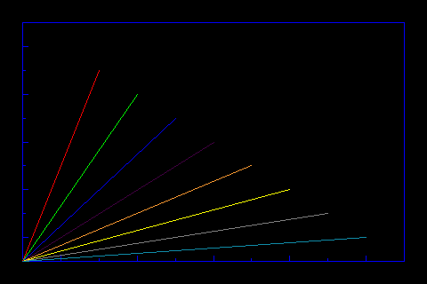
Polar Plot
Allows to plot polar graphs. You just need to give the values of the graph in a python list. See the examples folder for more information.
Table of Contents
Examples
API Reference
Other Links